
Redesigning Supply Feature for TxCOPE
This UX case study explores the redesign of TxCOPE's supply feature, focused on creating a more efficient and intuitive system to better support harm reduction outreach teams. By leveraging user insights and iterative design, the new feature enhances functionality to meet the teams' evolving needs.
ROLE
UI/UX Designer
TEAM
Tianhong Qiu
DURATION
JAN 2023 - May 2023
Introducing TxCOPE
A Platform To Fight Opioid Epidemic
TxCOPE is a platform built for communities and organizations to support drug overdose data collection and response efforts. By integrating anonymous overdose reports, hotspot visualizations, and the distribution of critical supplies like naloxone, TxCOPE empowers data-driven decision-making to more effectively tackle the opioid epidemic.

The Challenge
Bridging the Gap for Fast-Paced Outreach
Meet Sarah, a seasoned outreach professional working on the front lines of harm reduction. Every day, she moves swiftly through different neighborhoods, providing critical supplies like naloxone to those in need. In these unpredictable environments, speed and ease are everything. Although her organization introduced the TxCOPE mobile app to track supply distribution, Sarah found herself reaching for paper forms more often. They were quicker, simpler, and didn’t require navigating the app in chaotic situations. Sarah’s story revealed a crucial gap in the app’s design—it wasn’t intuitive or adaptable enough to meet the fast-paced needs of professionals like her.

Uncovering User Needs
Starting with Expert Insights
To uncover the true needs of outreach professionals, I began by interviewing internal domain experts who work closely with field teams. These interviews provided me with a foundational understanding of user profiles and the challenges they face. My focus was on understanding:
-
What is the process of a typical supply distribution activity?
-
How does TxCOPE currently support the supply distribution process?

Understanding the Workflow
A Typical Supply Outreach
A typical harm reduction supply outreach activity involves several key steps aimed at distributing supplies to individuals at risk while providing education and support. The process often varies depending on the specific organization, but here is an outline of the general steps:

Current Supply Distribution Approach
How TxCOPE Supports Outreach
TxCOPE provides tools for data collection and reporting. On average, an outreach organization could have from 30 to 50 types of supply items registered in TxCOPE. TxCOPE also offers a supply-kit feature that allows organizations to virtually bundle multiple items into a “kit.” This feature speeds up the distribution tracking process but can add complexity to inventory management.
After every outreach activity, a team member updates the TxCOPE inventory by selecting items from the organization’s inventory and entering the quantity distributed, along with the number of clients served. Depending on whether the team member is filling out the form on-site, they may also need to manually enter the distribution location.

Reassessing the TxCOPE Flow
Identifying the Weaknesses
While TxCOPE offers valuable planning information, such as near-real-time overdose hotspots and demographics of at-risk populations, it lacks integration between this data and the supply management tool. This disconnect leads to several challenges:
-
Users must rely on external tools to create outreach plans, which adds extra steps and disrupts workflow efficiency.
-
Users must navigate the entire organization’s inventory to update item counts, making the process cumbersome during a single outreach operation.
Defining Core Responsibilities
Separating Roles in Supply Outreach
Through observing how users handled these tasks, I noticed that TxCOPE relied on a single user type for inventory updates, failing to reflect the distinct roles and collaborative dynamics within outreach teams. This realization prompted me to conduct a detailed analysis of their processes, ultimately leading to the design of two specialized user categories, each tailored to specific responsibilities, to enhance system efficiency.
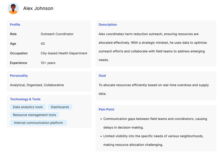
Outreach Coordinator
(Strategic Role)
The Outreach Coordinator designs and coordinates harm reduction efforts, using data to allocate resources and plan outreach activities. They ensure smooth execution by managing logistics and maintaining communication with field teams and stakeholders.
Key Responsibilities:
-
Planning and scheduling outreach activities based on data and trends.
-
Allocating resources (supplies, staff) effectively.
-
Ensuring coordination and communication between field teams and stakeholders.
Gathering Deeper Insights
End-User Feedback
To get a clearer picture of our users’ needs, I interviewed outreach professionals from organizations actively using TxCOPE in their daily operations. The goal was to gather their feedback on the overall platform experience, identifying both the positive aspects and areas needing improvement.
During recruitment, I carefully considered the roles of each participant to ensure a balanced mix of coordinators and front-line workers. In addition to gauging overall satisfaction, I focused on how the workflows differed between these two user groups. For this case study, I’ll focus specifically on insights related to the supply distribution and inventory features.
Example Questions for Outreach Coordinators
-
How do you typically plan an outreach activity?
-
How was TxCOPE able to help in the process?
-
Do you use other tools or technology in the planning process?
Crafting User Personas
Pinpointing Pain Points and Needs Through Interview Insights
Drawing from the interview insights, I developed detailed user personas to capture the distinct pain points and needs of each role. These personas serve as a guide to better understand how different users experience the platform, highlighting the areas where enhancements could make the most impact.

Reframing the Problem
Tedious Item Lookup Slows Down Distribution Logging
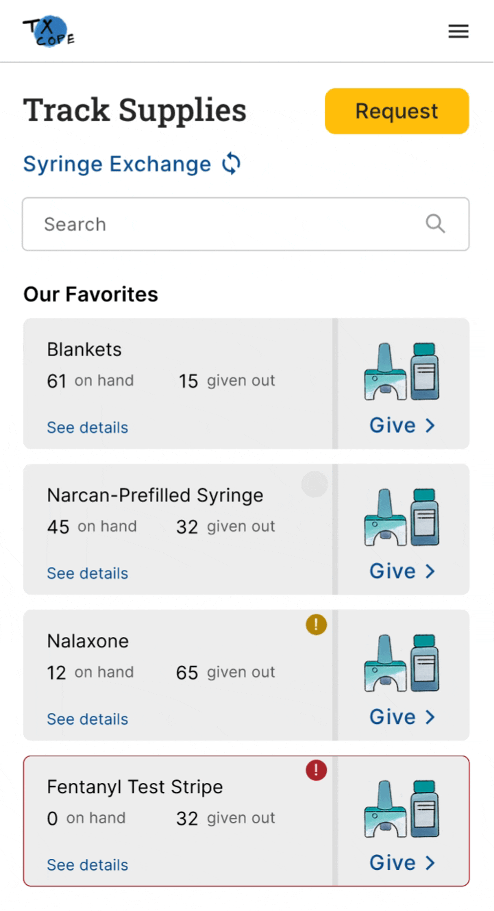
A major bottleneck in TxCOPE’s supply distribution process is the time-consuming task of logging supplies, primarily due to the tedious item lookup. Unlike e-commerce platforms that focus on user engagement, TxCOPE is built for efficiency—enabling outreach professionals to dedicate more time to life-saving work. However, with over 20 items to manage, the current system makes it challenging to quickly find supplies, resulting in slow form filling and lengthy distribution logging. Streamlining this process is crucial to boosting field efficiency.
The Supply Distribution System Redesign
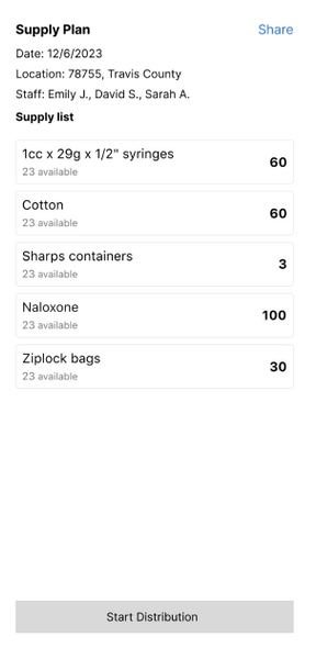
Introducing Outreach Planner
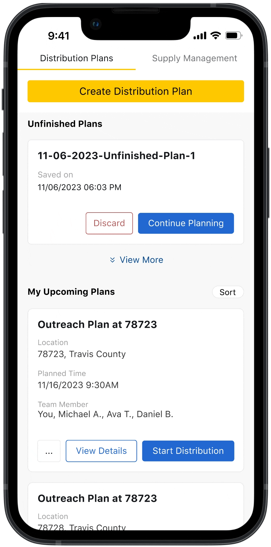
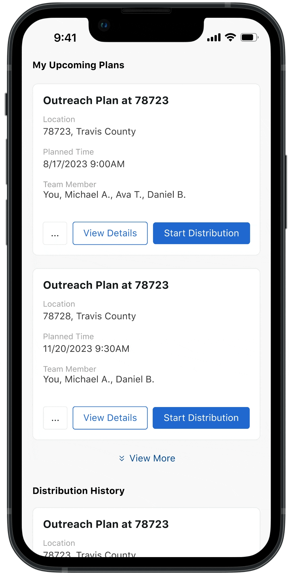
Recognizing the complexities of outreach environments, the outreach planner is designed to prepare the outreach team with effective plan to make in-field app usage fast and effortless. It streamlines the supply distribution process, promoting seamless team collaboration and enabling data-driven decision-making, ensuring that outreach professionals can focus on their vital work without being slowed down by cumbersome logging tasks.


Plan Smarter, Execute Better
The Outreach Planner feature allows coordinators to easily create and manage detailed outreach plans. Customize each plan to fit the team’s goals, track progress, and ensure nothing is overlooked. Whether it’s a single event or an ongoing initiative, this feature helps coordinators stay organized and maximize their impact.
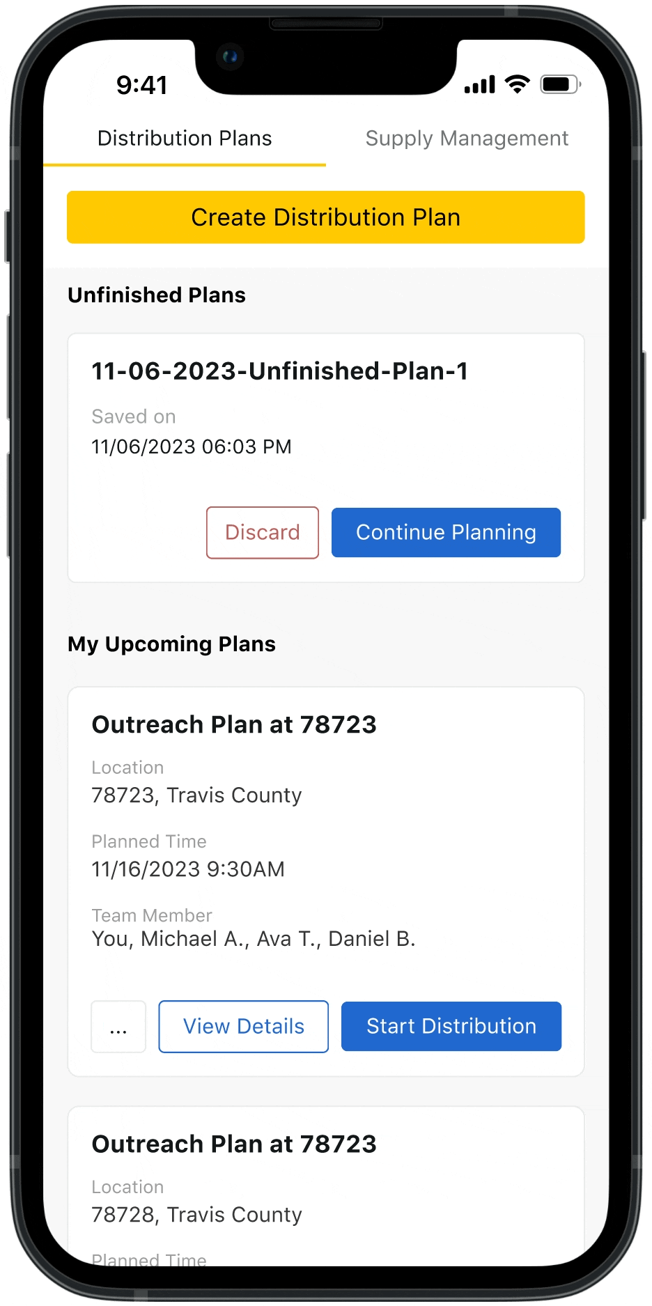
Effortless Planning in Just a Few Clicks
Creating an outreach plan is a breeze. Set the date, time, and location, assign roles, and organize necessary supplies—all from one intuitive interface. With a few quick steps, coordinators can craft a comprehensive plan that keeps the team aligned and ensures the outreach is well-executed.
All You Need for Planning
The outreach planner seamlessly integrates all necessary information into one streamlined dashboard, using intuitive visualizations and charts to bring data to life. Users can instantly see real-time stock levels, identify areas of need, and track distribution trends, ensuring they have the right supplies where they’re needed most. With clear projections and usage patterns, the planner makes it effortless to plan and execute effective outreach, optimizing resources with data-driven insights at every step.
Simplifying the Tech, Empowering the Outreach
Outreach workers operate in challenging environments where building trust within the community is essential. The outreach plans streamlines the app experience, allowing outreach teams to focus less on technology and more on forging meaningful, trust-based connections with the people they serve.
How We Got There
Customizing for Coordinators and Workers
Recognizing the distinct needs of coordinators and field workers, their experiences with the supply feature had to be tailored accordingly. This presented two key design challenges:
-
For coordinators: How might we streamline the planning process while ensuring the effectiveness of their strategies?
-
For workers: How might we simplify the in-app experience to make data logging as easy and efficient as possible?
To tackle these challenges, I took a targeted approach for each group. For coordinators, I focused on designing a planner that enhances the comprehensiveness and accessibility of information, enabling them to gather all the data needed to make informed decisions and streamline the planning process. For field workers, I simplified the in-app experience, focusing only on essential information. This created a more intuitive interface, improving usability and allowing for quick, easy data logging during outreach.
Empowering Strategic Planning
Designing for the Outreach Coordinator
After evaluating the current design, it became clear that both the infrastructure and the way supply information was displayed needed a complete overhaul. The goal was to create a more efficient and user-friendly experience tailored to the needs of outreach coordinators.
Enhancing Searching Accessibility
In addition to implementing fuzzy search and item recommendations, making the search feature accessible from any scroll position would significantly improve usability. This change allows users to search seamlessly without the need to scroll back and forth, ensuring quicker access to the supplies they need.
Before
After
Organizing Information Meaningfully
Structuring information in a more meaningful way can greatly enhance searchability. In addition to providing easy access to favorited items, implementing comprehensive filtering and sorting options will help users organize data effectively, supporting a smoother and more efficient planning process.

Showing Only the Necessary Information
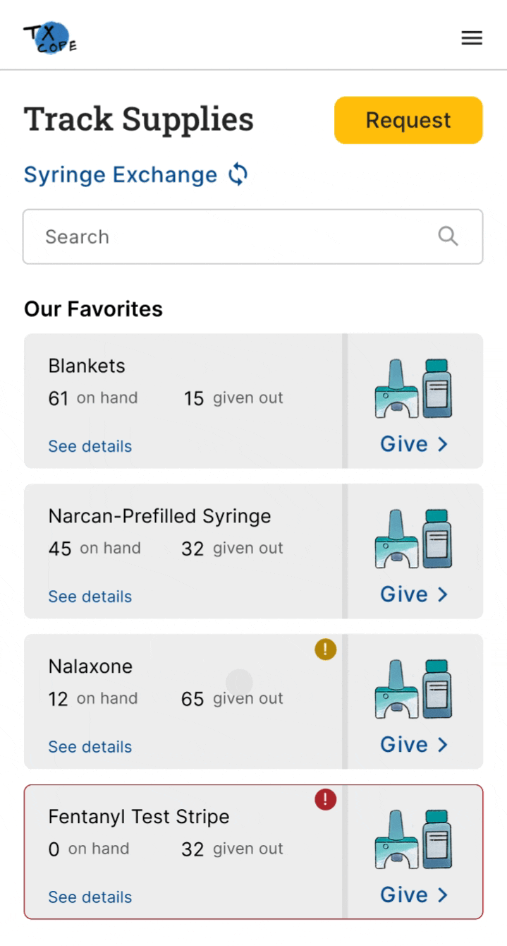
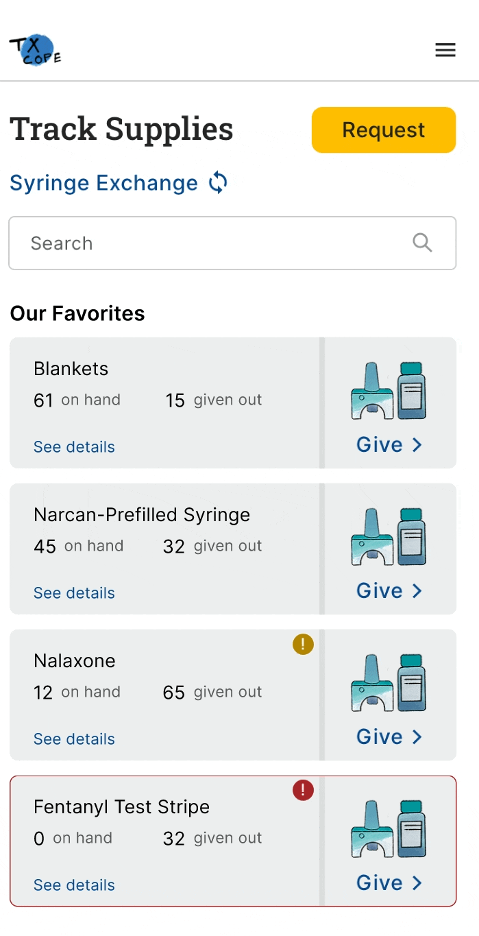
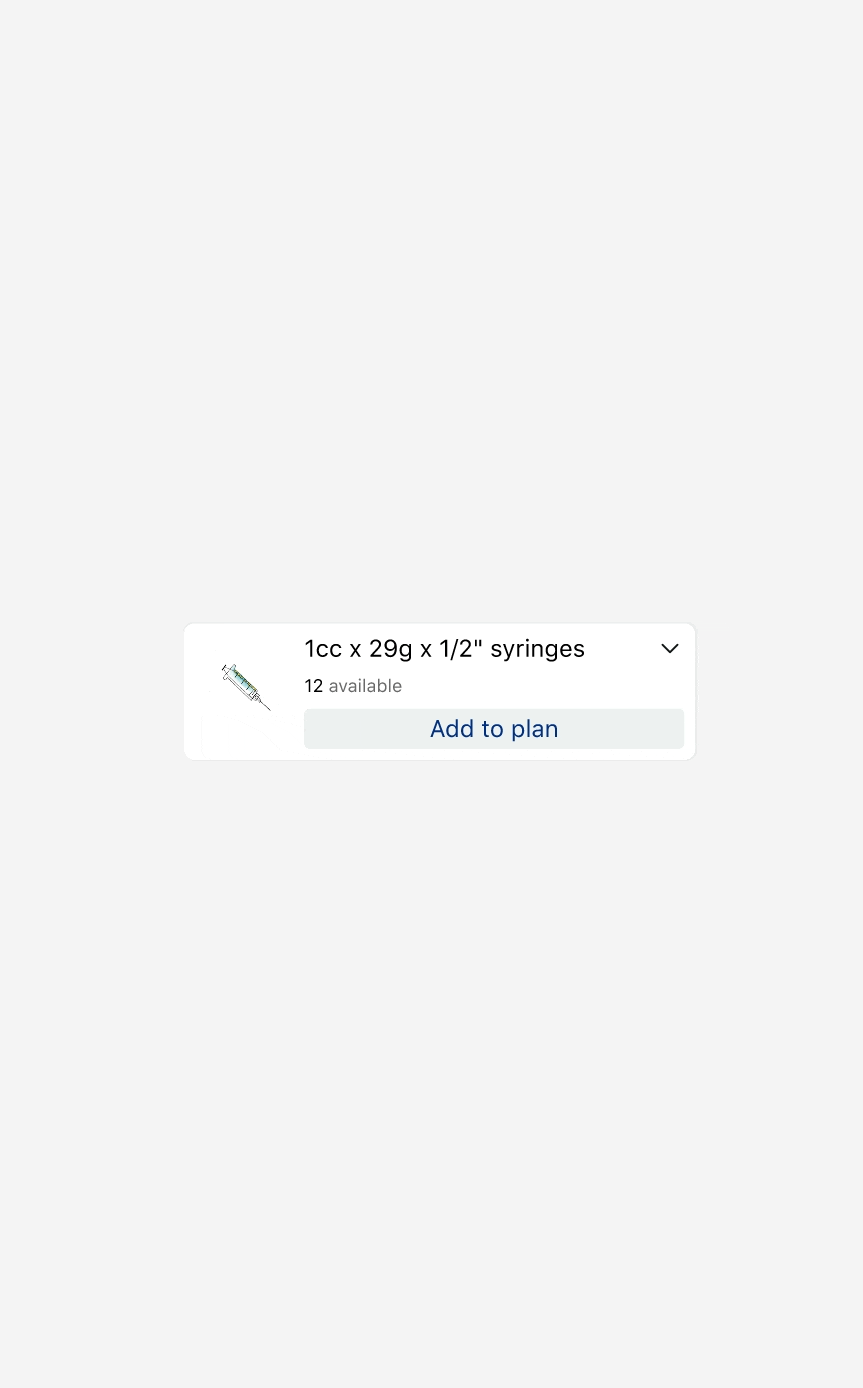
When refining the supply items feature, I started by thinking from the user's perspective. If I were using TxCOPE to create an outreach plan, what would I really want to know? While the current inventory levels would be crucial, the total number of supplies already distributed might be less important—unless I’m creating an annual report.
To address this, I began by decluttering the supply list, simplifying the language, and clarifying ambiguous icons to minimize confusion. The goal was to ensure that the interface presented only the most relevant information for outreach planning.

Before

After
In the details section, users should quickly find answers to key questions:
-
What supplies are currently available?
-
Which supplies are running low and need restocking?
-
Where are supplies most needed based on outreach data?
-
How have supplies been distributed over time?
-
How long will the current stock last given usage trends?
The original design attempted to provide this information but required users to dig through unclear terms and concepts. For example, it took some investigation to understand that “loose” referred to individual items, “in kits” indicated items within a kit, and “on hand” combined both values. For a new user, this could easily cause confusion.
Additionally, I noticed that the system treated individual items and customized supply kits the same way. This made stats like "loose" and "in kits" irrelevant for supply kits, as kits can't belong to another kit, leading to unnecessary complexity.

Guided by the key questions users need to answer, I focused on making the redesign as intuitive as possible. I organized the data into clearly defined sections and added descriptive titles to improve navigation and understanding.
For individual items and supply kits, I customized the design to ensure users could easily grasp the information they needed. For individual items, I highlighted the "in-kit" numbers to reflect their true availability. For supply kits, I simplified the display to focus on their composition, giving users a clear overview of what's included without unnecessary details.

Streamlining In-Field Experience
Designing for the Outreach Workers
For outreach workers, I aimed to simplify the app experience so they could focus on building trustful relationships with clients rather than navigating complex interfaces. I broke the experience into two key phases: the packing phase and the wrap-up phase, and used these as the foundation for the initial wireframe.

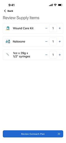
In the second iteration, I addressed feedback from workers about a flaw in the design. Since outreach workers are busy throughout the event, they typically count the remaining supplies at the end of the day. To align with this workflow, I updated the supply counter to subtract from the packed amount, instead of counting up from zero, and removed unnecessary information like inventory availability.
However, this second design quickly presented a new challenge—tapping a button 100 times to log supplies was a headache. To resolve this, I replaced the button with an input field, allowing workers to easily enter quantities. This approach received overwhelmingly positive feedback from testers and improved the overall usability.


Quantitative Analysis
Measuring the Impact of the Redesign
To evaluate the performance improvements, I designed a timed task to quantitatively measure how long the supply distribution process took. Each participant was given a written list of eight supplies, along with the quantities to be distributed, the number of clients served, and a specified location. The timer started once the participant was familiar with the information and stopped when they completed the distribution logging.

The results were encouraging—on average, all four participants saved around 60% of the time when using the redesigned system.

Reflection
Looking back on the development of this feature, I learned a critical lesson: never rush into solutioning without fully understanding the problem. It's easy to jump straight into designing features, but the real key to success lies in grasping the core issues that users face. Applications, particularly in a business context, are tools meant to make people’s work more efficient, not just collections of features. Through this experience, I realized that design is fundamentally about problem-solving, and that the best solutions come from a deep understanding of real-life workflows. Only when the designer takes the time to thoroughly explore how users operate, their pain points, and their goals can they deliver solutions that truly meet users' needs and improve efficiency.
Future Work
As part of future enhancements, updating the desktop flow for the outreach planner will be a key focus. The goal is to provide a more comprehensive, user-friendly experience for desktop users, optimizing the layout for larger screens and introducing more advanced functionality.